kolibri.png → kolibri.svg · default settings
Shaded logos, rebuilt with real gradients
Crisp Vector fills each shaded shape with a real SVG gradient you can edit in Figma or Illustrator. It switches on by itself when your logo has shading.
kolibri.svg · 11.2 KB
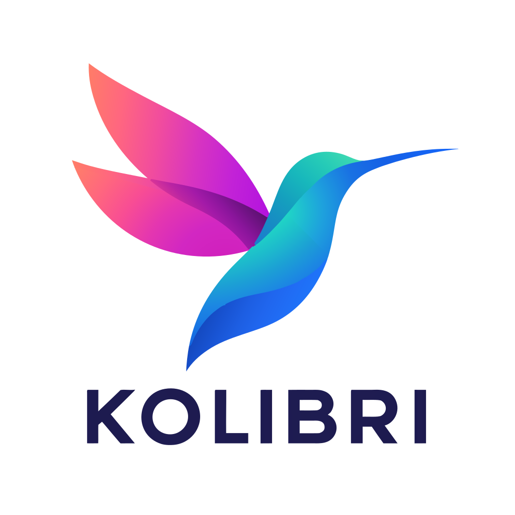
In the file
- Shapes
- 12
- Gradients
- 14
- Size
- 11.2 KB
- From
- kolibri.png, 780 KB
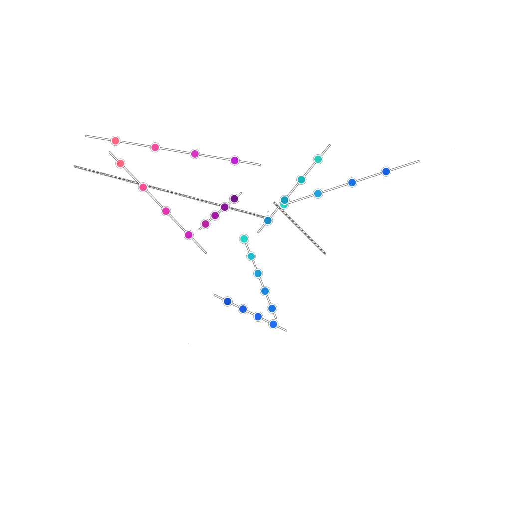
Shading gradients
- Linear · 6 stops
- Radial · 6 stops
- Linear · 6 stops
- Radial · 6 stops
- Radial · 6 stops
- Linear · 6 stops
- Linear · 6 stops
One shaded logo, three converters
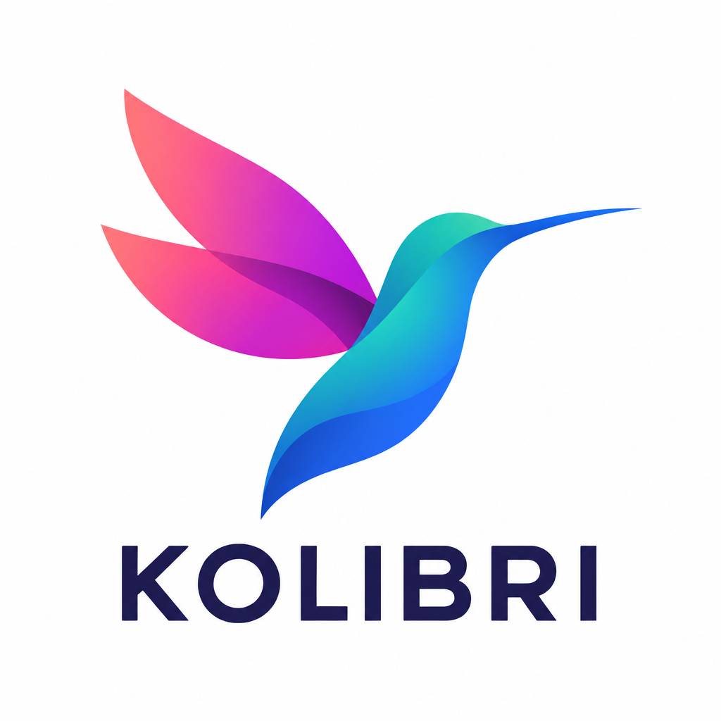
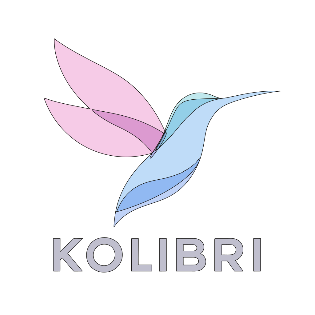
I ran this Kolibri hummingbird PNG through Crisp Vector, Vector Magic and Recraft on default settings. Vector Magic outputs 75 flat-colour shapes with visible banding, and Recraft gets closer with real gradients in looser shapes, while Crisp Vector rebuilds it cleanly as 12 shapes and 14 editable SVG gradients.
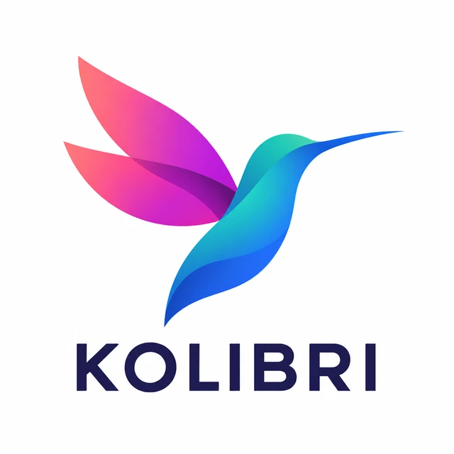
kolibri.png · the input
Made with ChatGPT, lightly shaded, on plain white.
 Crisp Vector
Smooth gradients in clean shapes. The wing’s shadow keeps its fade.

 Vector Magic
Every gradient turned into a stack of flat bands, like contour lines.
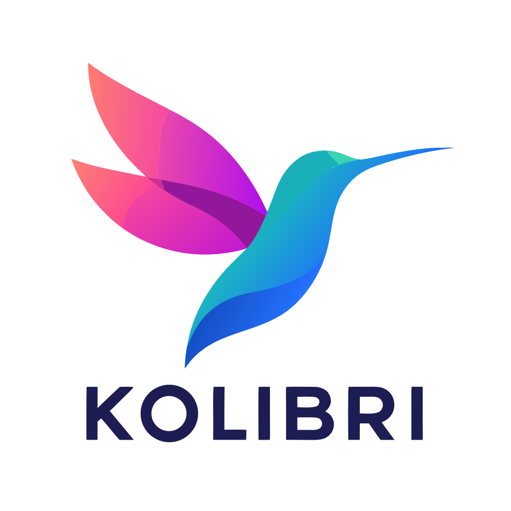
 Recraft
Real gradients, but a seam runs through the wing and its shadow comes out flat.
Look closer
The loupe starts on the wing’s shadow, where the shading is deepest. Each window is the SVG itself, magnified 3 times, so what you see is what’s in the file.
Tap the logo, or drag sideways across it, to look anywhere.Move your pointer over the logo, or focus it and use the arrow keys (Shift for bigger steps).
- Input pixels
- Crisp Vector
- Vector Magic
- Recraft
| Measure | Crisp Vector | Vector Magic | Recraft |
|---|---|---|---|
| Colour error Average difference from the PNG, out of 255 | 2.8 | 3.2 | 5.6 |
| Banding Share of the logo with an edge the PNG doesn’t have | 0.01% | 7.4% | 0.37% |
| Shapes A shape holding several gradients counts once | 12 | 75 | 23 |
| Gradients Real SVG gradients in the file. 7 of Crisp Vector’s are near-flat letter fills. | 14 | 0 | 6 |
| File size The SVG as it came out | 11.2 KB | 72.2 KB | 14.9 KB |
Every tool got the same PNG and ran on its default settings. I rendered each SVG at the PNG’s size and compared the two pixel by pixel. Vector Magic keeps the white square behind the logo, which counts as one of its shapes. Download each file as it came out: Crisp Vector, Vector Magic, Recraft.
How it works
A flat-colour tracer picks a fixed palette and draws a boundary wherever one palette shade meets the next, which turns every smooth fade into a stack of bands. Crisp Vector flips that order: it finds the real shape edges first, and then solves the gradient inside each shape.
-
Find the edges
First, the converter smooths out pixel grain while keeping hard edges sharp, and measures how fast colour changes across the image. A gradient shifts gradually over many pixels, whereas a real shape edge steps in one or two.
-
Fit a gradient to each shape
Each shape gets the linear or radial SVG gradient that best fits its pixels. When one straight or circular gradient can’t follow a curved ribbon on its own, the converter splits that shape into a few clipped pieces, each with its own gradient.
-
Fit them all together
If you fit each gradient in isolation, neighbouring pieces don’t quite match where they meet, and you see seams. So Crisp Vector refits every gradient together in one pass to keep smooth joins seamless and real edges crisp, then traces the outlines to sub-pixel precision.
You don’t switch it on
Before tracing, the converter checks whether solid flat fills are enough to represent your logo cleanly. On a flat logo they are, so nothing changes. With that automatic check, 544 of the 556 logos in my test set came out byte-for-byte identical, and none of the 51 flat AI logos switched it on. When I forced shading on across the 37 most shaded and gradient-heavy logos, it came out closer to the input than flat tracing on 20, tied on 17 and lost on none.
For the technically curious
- Grain
- An edge-preserving (bilateral) filter, over fully opaque pixels only, so a transparent background can’t bleed into the artwork.
- Edges
- Colour change is measured in CIE Lab, which tracks how strongly people see a difference. About 1,500 small pieces grow from seeds (a watershed), then merge across every border that is a fade rather than a step.
- Small details
- A small region is kept when its whole border is a clear step and its colour is its own: a highlight, a pupil, a letter. A thin strip whose colour is a blend of its neighbours is anti-aliasing, and it goes.
- Gradients
- Linear gradients in 24 directions and radial ones from a grid of centres, each refined, with six stops solved by least squares. A cut is kept only if it takes the error under 85% of the uncut fit.
- Seams
- All the gradients are solved together as one sparse least-squares problem, with conjugate gradients. Neighbours must agree across a cut, and across a border unless the PNG has a real step there.
- Output
- Paths, polygons, linear and radial gradients and clip paths: plain SVG 1.1. No filters, meshes or embedded images, and the same PNG always gives the same file, byte for byte.
What it handles, and what it doesn’t
It’s built for the lightly shaded look that AI tools and modern brands use. Here’s where it works well and where it still falls short.
Works well
-
Gradients and soft shading
Ribbons that fade from one colour to another, gentle shading where one shape passes behind another, light 3-D modelling.
-
Colour that follows a curve
A spiral or ribbon whose colour runs along it is cut into a short chain of pieces, each with its own gradient.
-
Flat parts of a shaded logo
A wordmark or outline next to the shading keeps its own crisp edges.
Falls short
-
Grain and texture
Film grain and noise are smoothed away on purpose, not copied. The SVG is the clean version of the logo.
-
See-through shadows and glows
A logo made mostly of soft, semi-transparent shadows is traced the normal way, and the shadows are approximated.
-
Very close up
At normal sizes it reads as the original. Zoom in three times or more and you may see faint lines where two pieces of a shape meet.
-
Photos
An image that still breaks into more than 128 regions after a second, coarser try is treated as a photo and traced normally. This is for logos and illustrations.
One thing to check before you print: screen printing, vinyl cutting and embroidery work in flat colours, so a shaded logo has to be simplified for them anyway. If that’s where your logo is going, ask your AI tool for a flat version too.
The prompt behind it
The Kolibri logo came from ChatGPT in one go, from this prompt. Light shading converts best. Heavy gloss and glow are harder to rebuild and harder to print.
- Ask for light, subtle shading, like a modern app icon.
- Give it your colours as hex codes, a pair for each fade.
- Rule out glow, gloss, bevels, drop shadows and grain.
- Keep the wordmark flat, on a plain white background.
Prompt · ChatGPT
A finished modern logo for "Kolibri", a fresh juice bar.

The icon is a hummingbird in flight, built from a few bold, smooth, overlapping ribbon shapes: a curved body, two swept wings and a long thin beak. Each shape has a soft, subtle gradient across it (light shading, like a modern app icon): teal #14B8A6 blending into deep blue #2563EB on the body, and warm coral #FB7185 blending into magenta #C026D3 on the wings. Gentle shading only, where one ribbon passes behind another. Clean crisp edges between shapes.

Below the icon, the wordmark "KOLIBRI" in a clean geometric sans-serif, solid dark navy #1E1B4B, flat colour.

Style: polished modern gradient logo, lightly shaded, not glossy, no 3D bevel, no glow, no drop shadow, no grain or noise texture, no outlines, no mockup.

Centred on a plain white background with generous padding. Spell the name exactly "KOLIBRI".
Questions about shaded logos
No. The converter checks every logo and uses gradients only when flat colours can’t paint it. Upload it the same way as any other logo.
No. With the automatic check, 544 of the 556 logos in my benchmark came out byte-for-byte identical, and it only switched on for the remaining 12, which were almost all gradient logos. None of the 51 flat AI logos triggered it.
Yes. Each one is an ordinary SVG linear or radial gradient with its own colour stops, so you can recolour it, move it or swap it for a flat colour in your editor. Where a shape needed more than one gradient, it’s a group of pieces inside the shape’s outline, like a clipping mask.
Because every band of every gradient is its own shape. Vector Magic drew the Kolibri logo with 75 shapes in 72 KB. Crisp Vector drew it with 12 shapes and 14 gradients in 11 KB.
Usually, for anything printed in full colour, such as cards, flyers, signs and stickers. Check which format your printer asks for. Screen printing, vinyl cutting and embroidery work in flat colours, so for those you’ll want a flat version of the logo as well.
No. It’s for logos and illustrations. A photo breaks into far too many shapes, so it’s traced the normal way, and a photo is better kept as a PNG or JPG anyway.